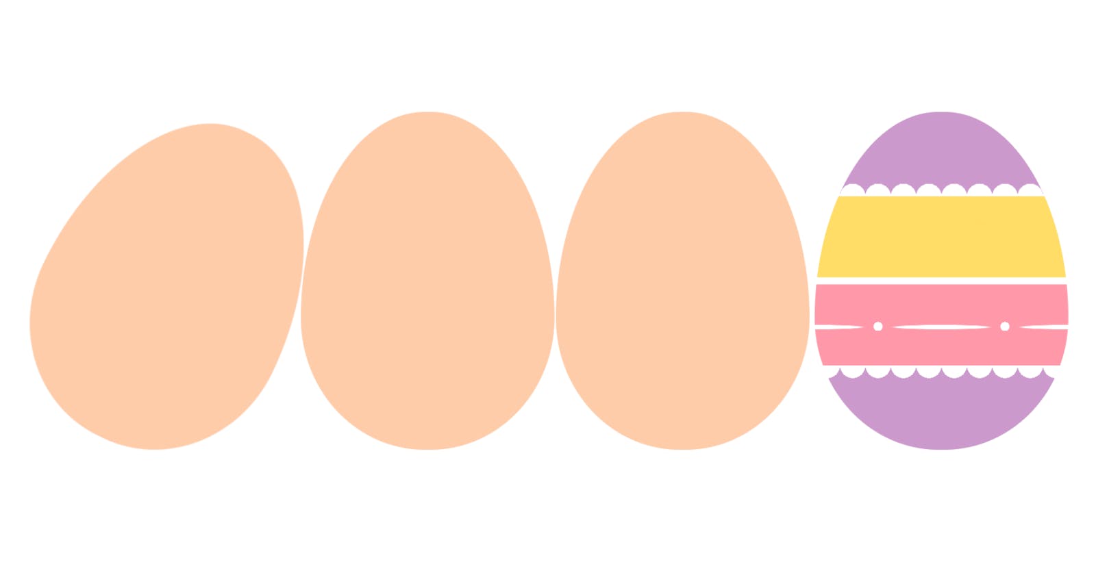
Drawing an Egg with CSS
Enjoy some time decorating CSS Easter eggs this weekend
Drawing an egg with CSS is simpler than many people imagine. So simple that you can do it with just two properties:
.egg {
  aspect-ratio: 3 / 4;
  border-radius: 100% / 125% 125% 80% 80%;
}
Yes. That’s it! Apply that to a block element, and it will have an egg shape. Let’s see how it works:
aspect-ratio: 3 / 4: this value ofaspect-ratioindicates that the element will have a width-height proportion of 3-to-4 (e.g., if the width is 300 pixels, the height will be 400 pixels.)border-radius: 100% / 125% 125% 80% 80%: this indicates that the horizontal radius will be 100%, but the vertical radius will be longer in the top (125%) than the bottom (80%), creating the natural egg shape.
The real trick is that the border-radius property can have more than the 1–4 values people usually use. Both horizontal and vertical radii can be specified (separated by a forward slash, with 1–4 values each), allowing oval figures to be created.
Here’s a simple demo showcasing the effect:
Seriously. That’s it! It is that easy. It will take more time to decorate the egg-shaped components than to create the egg-shape itself… And that’s where the fun begins. Enjoy this Easter weekend by decorating some CSS Easter eggs 🤓
And you can even get more creative and draw your own version of an eggy cartoon character. Like this CSS version of the main character in the children’s book The Good Egg by Jory John and Pete Oswald:
