

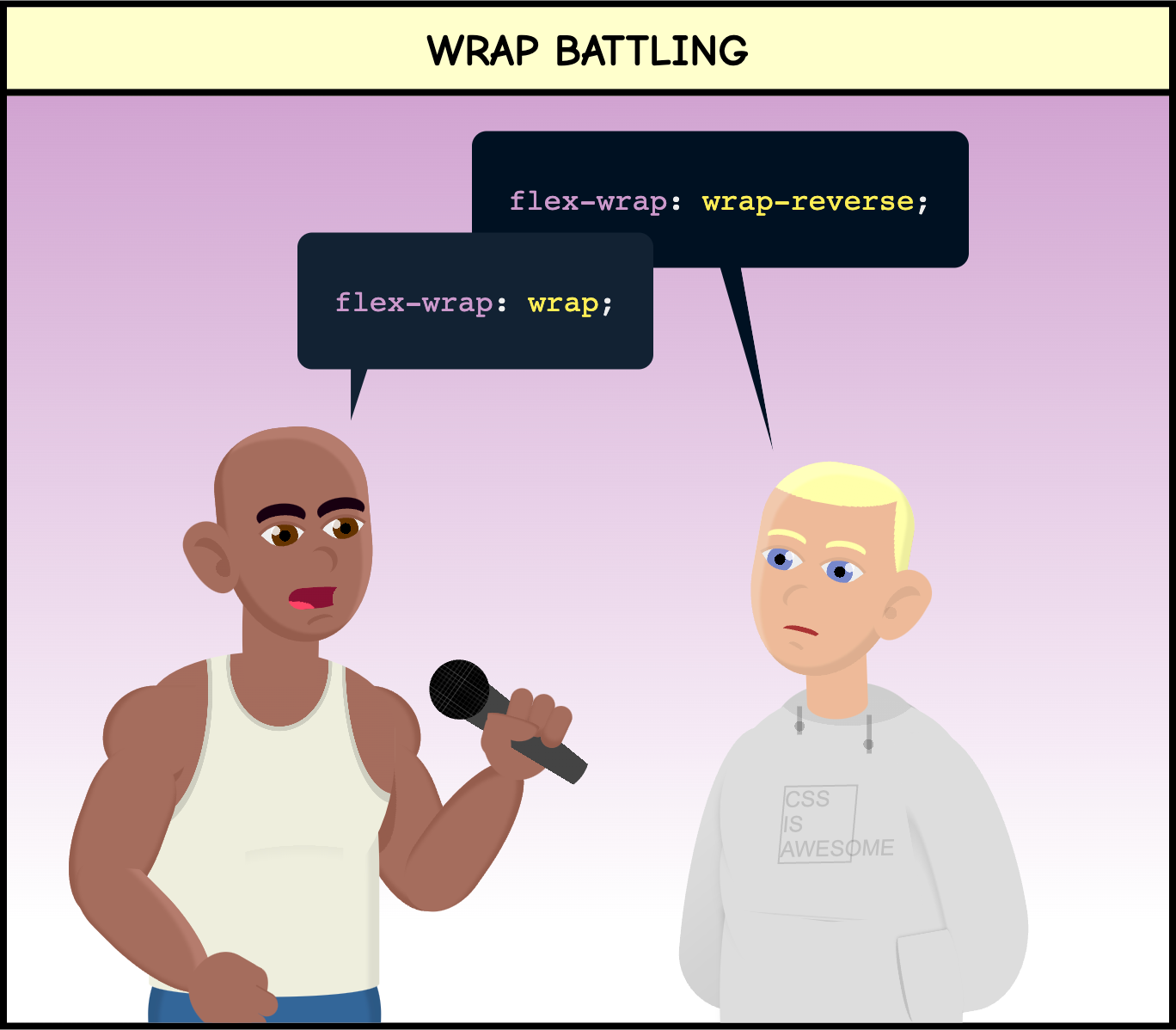
Rap battling (or battle rap) is a type of rap performance in which two or more rappers sing against each other (generally including some insults/attacks). Today’s comic plays with the homophones Rap and Wrap to make a silly joke with Flexbox and the flex-wrap property.
A flex container will lay out the content in a single line by default. This may be Ok, but if the items’ size exceeds the container, they will be squeezed or they will overflow. So instead, we may want to get the content into multiple lines. This is where flex-wrap comes into action.
This property defines if a flex container will be single-line or multi-line (depending on the amount and size of the flex items), and in the case of multi-line, it defines how the items will be stacked after wrapping.
flex-wrap has three main values:
nowrap: the items will not wrap; instead, they will adjust their size or overflow the parent. (This is the default value.)wrap: the items will wrap instead of overflowing the flex container. They will stack from cross-start to cross-end.wrap-reverse: the items will wrap instead of overflowing the flex container. They will stack from cross-end to cross-start.
The cross-start and cross-end part may sound complicated, but it is easier than what it sounds. It depends on the direction of the flex: if the direction is horizontal (“row”), then the wrapped elements will stack vertically (in rows); and if the direction is vertical (“column”), the wrapped elements will stack horizontally (in columns).
Let’s check an example with a flex container with 5 items with a defined width. By default, the value of flex-wrap is "nowrap", so the flex items will overflow the container (I put it as an image to avoid the annoying horizontal overflow it would create):

Now, if we change the code to set a value of “wrap” for flex-wrap, when the flex items would overflow the container, they wrap into a new row instead (live demo):

But if we set flex-wrap to "wrap-reverse", then the direction of the wrapping is the opposite: instead of getting into a new row, the wrapped elements push the others into a new row.

One last example with the flex-direction set to "column." In this case, the elements organize vertically in columns, so when they wrap, they do it in columns instead of rows:

I hope these examples were useful and that you enjoyed today’s comic. Learn more about flex-wrap on the following sources: